
Secure Text: making privacy understandable, visible, and testable
A concept-led messaging experience that reframed “secure chat” as a systems problem: not just encryption, but state clarity, trust, recovery, and user comprehension across ambiguous moments.
- Framed the problem before jumping to UI.
- Led synthesis from research → concept → prototype.
- Defined the mental model, core flows, and evaluation criteria.
- Users could not tell when they were protected.
- Entering or exiting secure states felt risky.
- Recovery paths were unclear, so trust broke quickly.
Context
The actual problem was not “how do we add a secure mode to chat?” It was: how do we make privacy legible enough that users trust it, use it correctly, and recover when they make mistakes?
That shift matters. Many products technically protect users, but fail at the experience layer because the system state is invisible, the language is vague, and the transitions feel fragile. I approached Secure Text as a product strategy problem disguised as a UI problem.

Why this matters strategically
This case study aligns with strategic UX research work because it sits in the zone where ambiguity is high, internal alignment is incomplete, and the value of research is not just validation, but direction setting.
- What makes users believe a message is actually private?
- What moments break trust fastest?
- Which state changes must be unmistakable?
- Comfort operating with incomplete information.
- Ability to frame a complex problem before it is fully defined.
- Ability to produce a concept, not just findings.
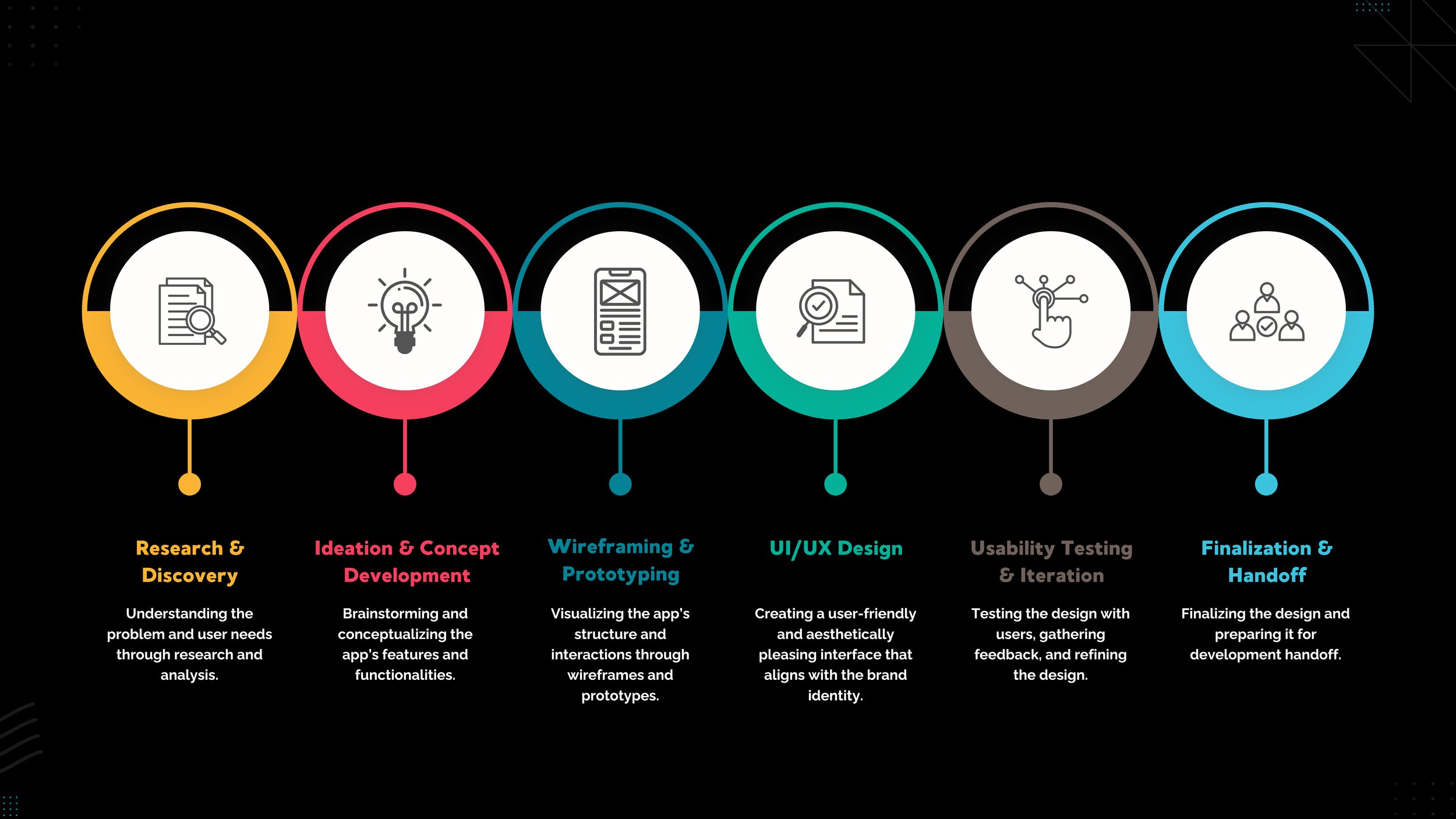
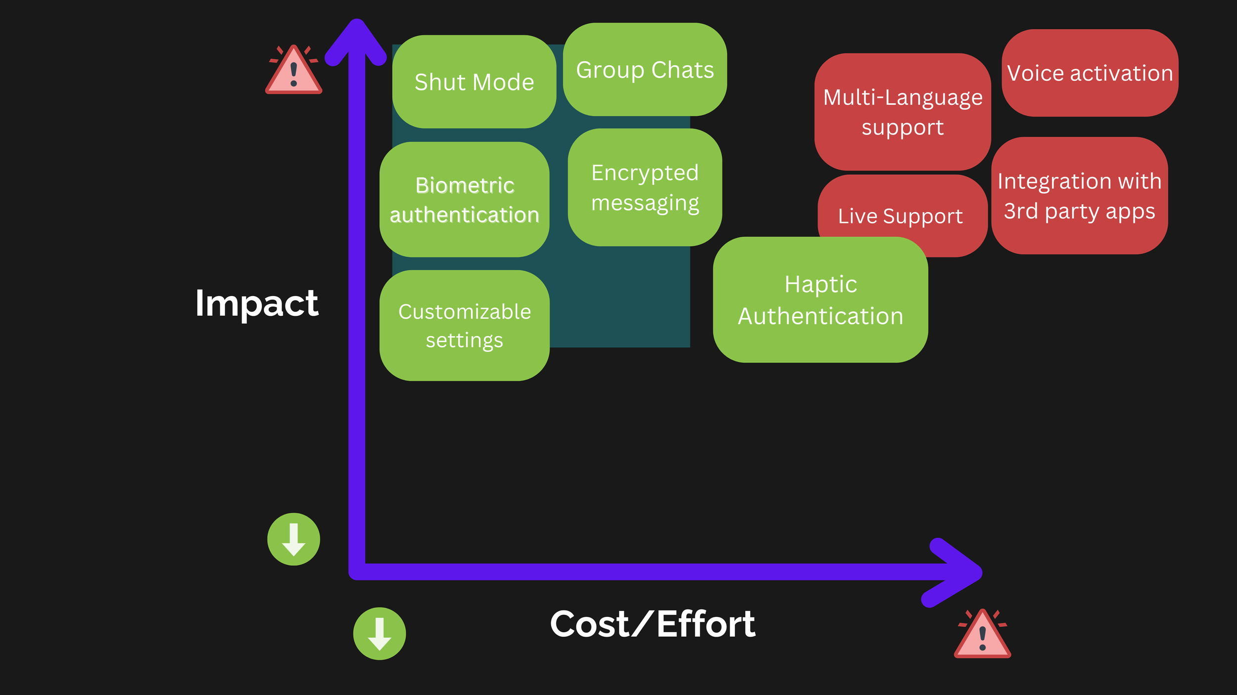
Process
This was an iterative loop: frame the uncertainty, identify the highest-risk assumptions, prototype the concept, and use research to refine the model rather than just polish the interface.
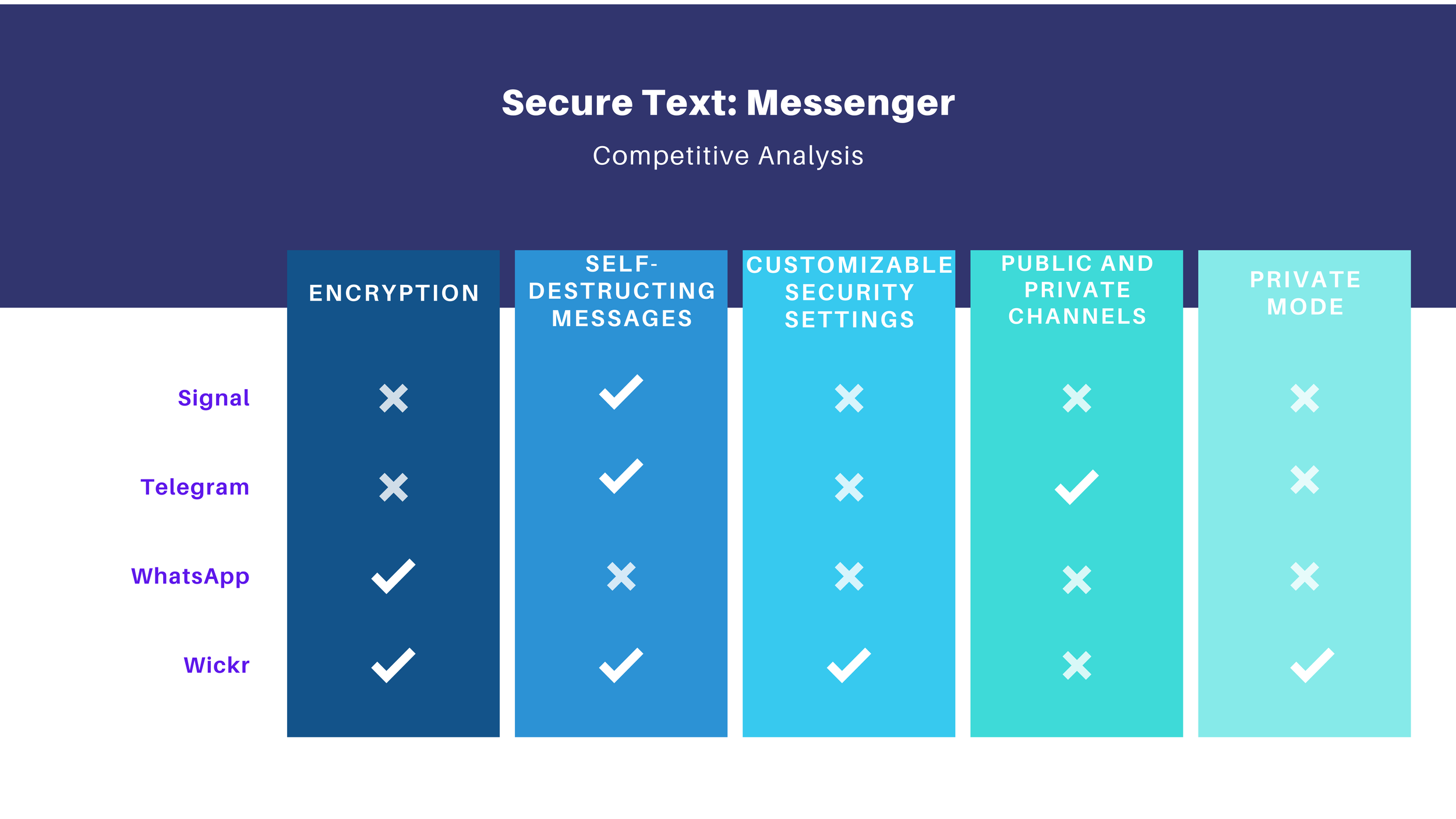
Research that drove the direction
This section matters because the work was not “I researched, then I designed.” It was: I used research to shape the product model. Each artifact answered a different uncertainty.
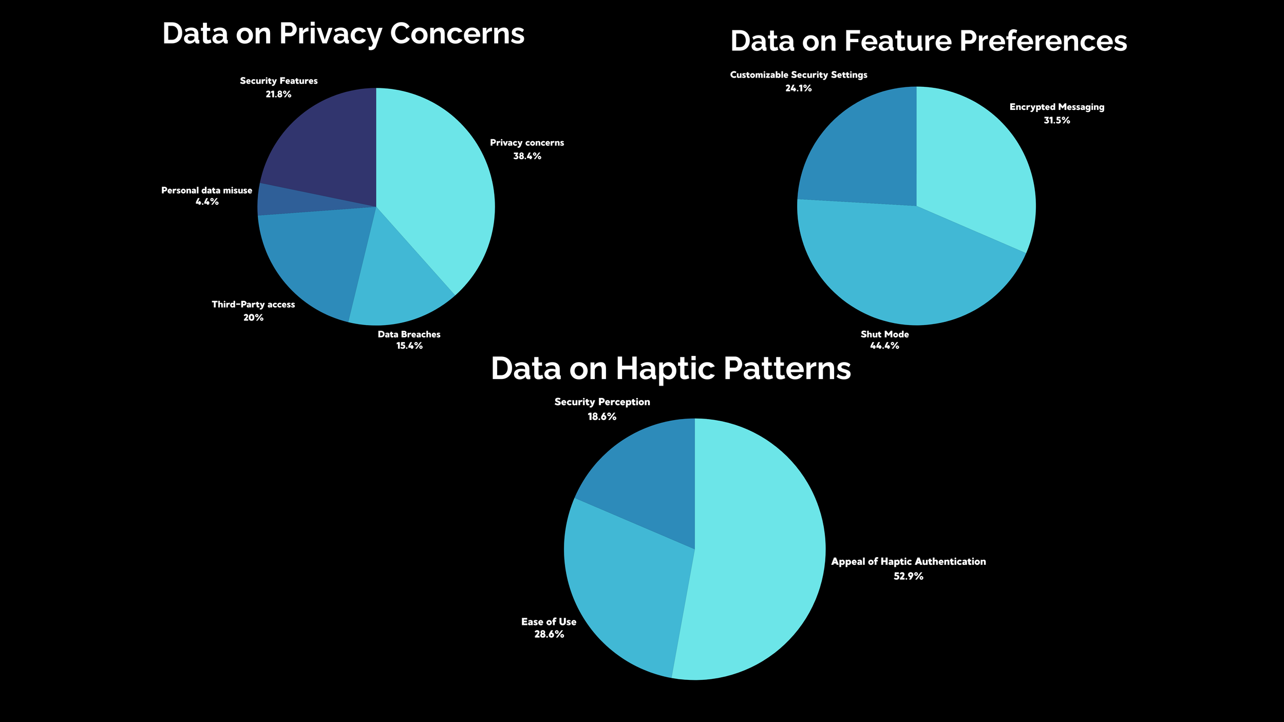
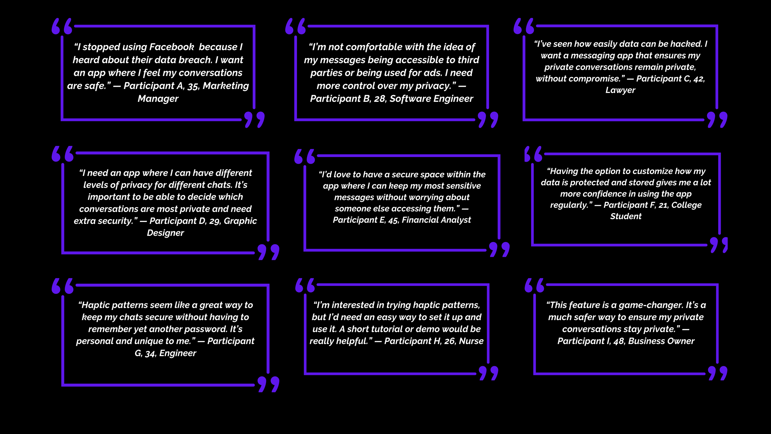
- Users do not trust “security” by default.
- They trust what they can verify in the moment.
- That made state visibility the center of the experience.
- “Shut Mode” needed a clear, persistent presence.
- Entering and exiting needed explicit confirmation.
- Recovery needed to feel safe, not punitive.
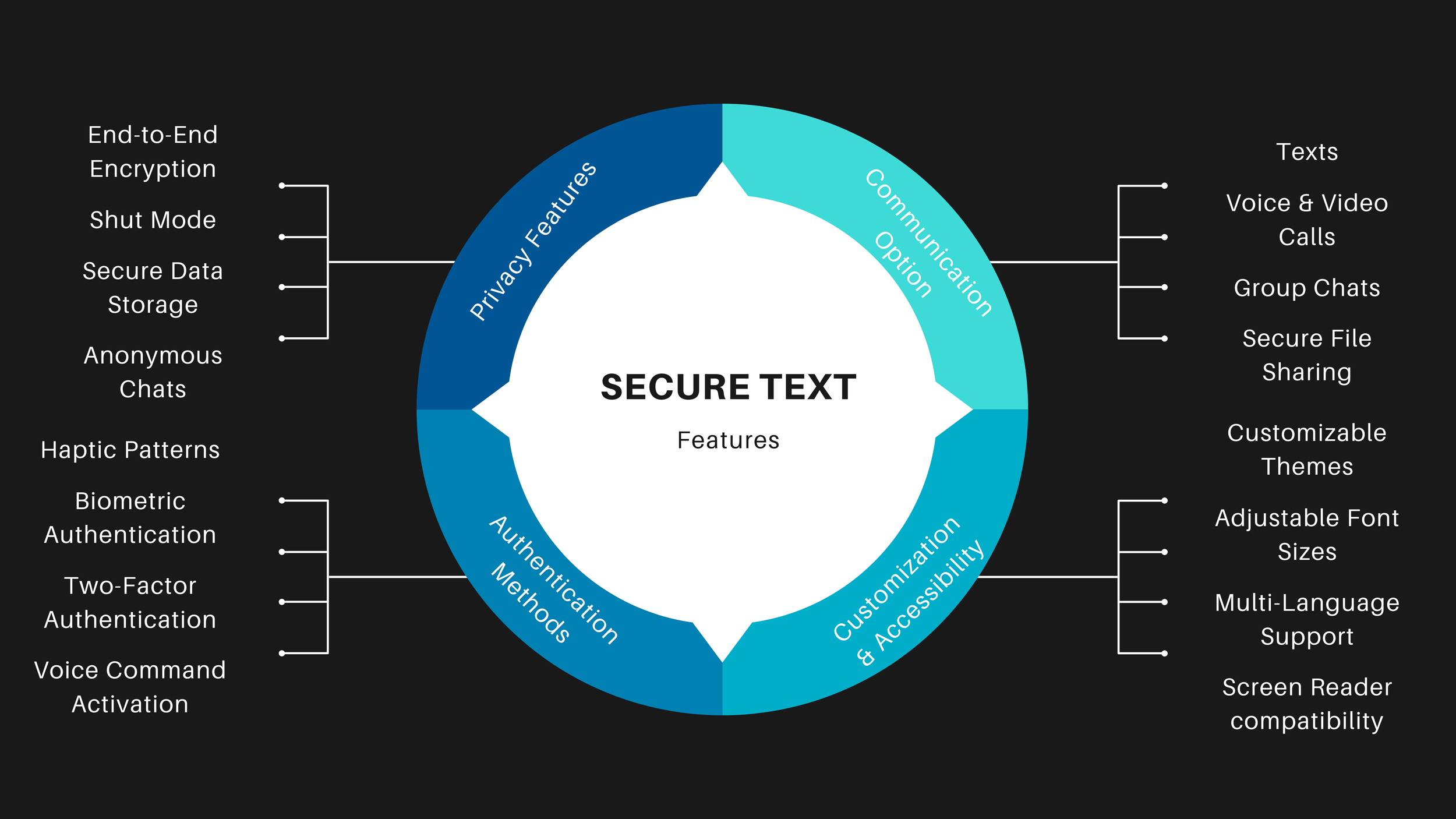
The solution
The design direction was to make secure messaging feel less like an invisible technical mode and more like a clearly understood state with visible rules, explicit transitions, and reassuring recovery.
Ideation (Figma)
The low-fidelity phase was used to work through structure, sequencing, and mental model choices before visual polish. This is where the concept became tangible enough to challenge.
Wireframes
The wireframe phase pushed the concept from abstract structure into concrete states, pathways, and recovery conditions. This is where the design became specific enough to evaluate for misuse and comprehension.
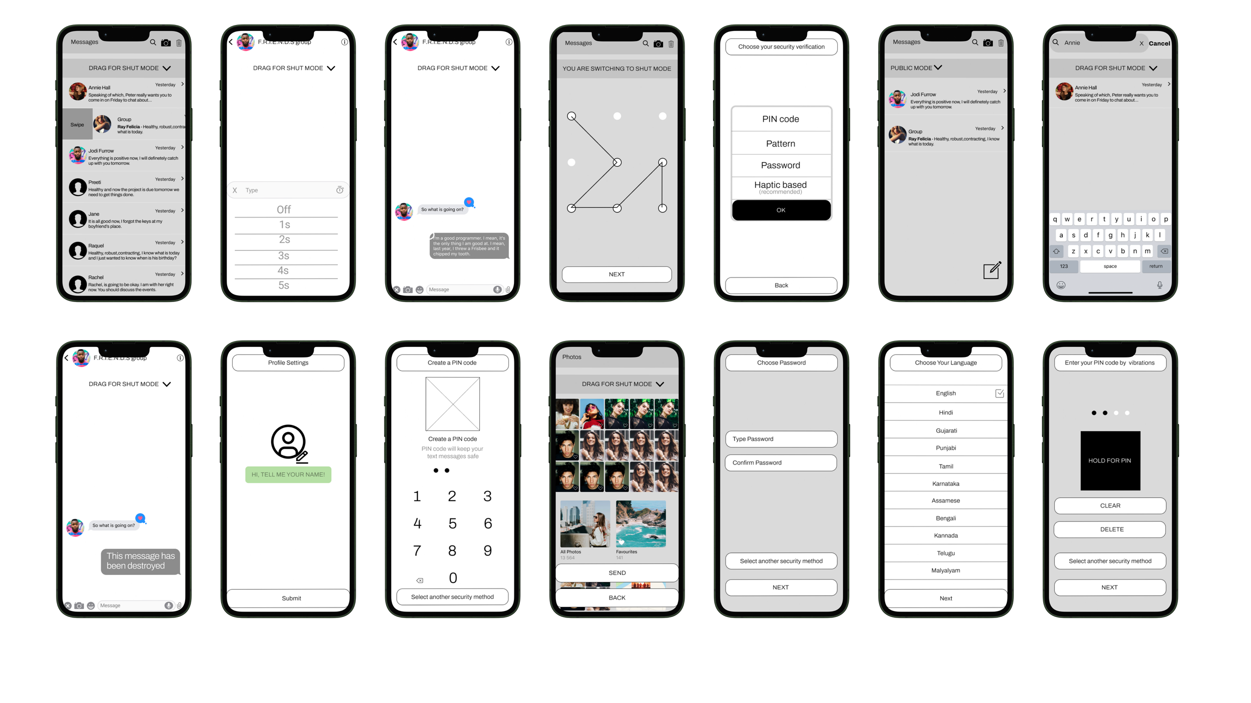
Prototype evolution
Showing both versions matters. The first prototype is proof of exploration. The second is proof of learning. That progression is more useful to a hiring manager than pretending the first answer was right.
Final redesign (official prototype)
Results
The redesign improved performance because it addressed the real issue: not lack of functionality, but lack of clarity around security state. Once the model became understandable, the experience became more usable.
- Security state became visible, not implied.
- Entry and exit were made explicit and legible.
- Microcopy clarified what was protected and when.
- The concept moved from technical promise to user trust.
- The prototype served as evidence, not presentation polish.
- The work shows how research can change product direction, not just validate UI.
Next steps
If this moved forward as a product direction, the next phase would focus on scaling confidence in the concept: broader validation, measurement strategy, and stronger system guidance.